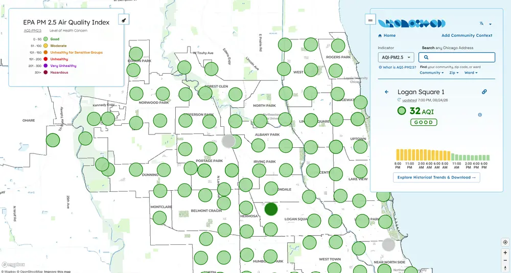
Researchers, city leaders, and community organizations have worked together to build one of the nation's largest urban air quality monitoring networks across Chicago. Now, a new public-facing website is making that wealth of information easier for residents to explore, understand, and use in their own neighborhoods.
Developed through a collaboration between the University of Illinois Urbana-Champaign, the University of Illinois Chicago, and community partners and residents across Chicagoland, Our Air Chicago transforms data collected from hundreds of air quality sensors into an interactive mapping platform that helps residents search by neighborhood, compare historical trends, overlay environmental justice data that highlights communities facing greater pollution burdens and vulnerability, and explore other neighborhood characteristics across Chicago—all to better understand the air they breathe.
The project builds on the sensor network developed through the work of Serap Erdal, a professor of environmental and occupational health sciences at UIC, and her team, while the Healthy Regions and Policies Lab at Illinois, directed by Marynia Kolak, led development of the public-facing dashboard.
Designed with communities from the start
For Kolak, a professor of geography and geographic information science, the dashboard was never intended to be just another place to view air quality data.
"The goal is really to be a bridge from the air quality data from the largest sensor network in the country. But rather than just providing that information, we also want to enable folks to explore the data. We want folks to be able to do scientific exploration and bring in some community context."
Rather than designing the platform first and asking communities to use it later, Kolak and her team brought community members into the development process from the beginning. Surveys, focus groups, and co-design sessions with environmental justice organizations, educators, healthcare professionals, and Chicago residents helped the team understand how people currently access air quality information, what they want to know, and which tools would make the data more useful.
That feedback shaped everything from the site's organization and language options to the map layers and educational resources included on the platform.
"In the scientific community, there's a lot of excitement about this being based on the largest sensor network in the country,” Kolak said, “but for community groups, that may not be what they care about most. They care about the data, the community context, and bringing in other information."
Turning information into understanding
While existing resources already provide access to sensor readings, Our Air Chicago was designed to answer the next question many residents have: What does this information actually mean?
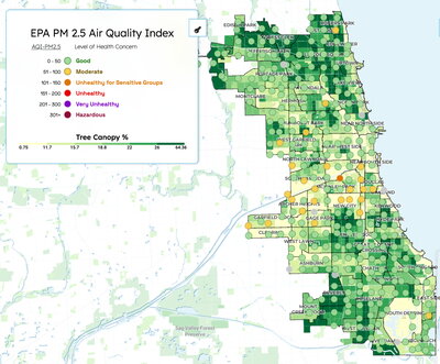
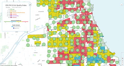
The dashboard allows users to explore air quality alongside a range of neighborhood data, including historical redlining maps, tree canopy, schools, land use, and other community characteristics. Together, those layers allow residents to investigate how air quality may intersect with the places where they live, work, and learn.
"Rather than just checking air quality for that day, and being unsatisfied, it helps to do some detective work," Kolak said. "The goal of the website is that people have that additional data and options so they can explore."
The platform also serves as a central hub for learning, offering introductory air quality information, classroom activities, health resources, and links to organizations and city services to make environmental science more accessible to everyone.
Kolak said creating that experience required close collaboration among researchers, designers, developers, and students. She credited lead software engineer Sara Lambert of the National Center for Supercomputing Applications and product designer Shubham Kumar with helping transform community feedback into a dashboard that feels approachable while supporting sophisticated mapping tools behind the scenes. Illinois graduate students Mahjabin Kabir Adrita and Catherine Discenza also contributed their technical geocomputational skills to the project's research.
"Air pollution can be really stressful," Kolak said. "We wanted people to feel calm, collected, and empowered as they navigate through things because we don't need to add more stress where there's air pollution. Navigating data shouldn't be stressful."
A resource that will continue to grow
The dashboard is designed to evolve as new data, resources, and community feedback become available. Future updates will expand tutorials, improve data exploration tools, and continue adding information requested by users. It’s available in English, Spanish, Polish, and Mandarin, with more options coming.
For Kolak, however, the project's greatest potential isn't measured by the number of sensors or datasets available. It's what people choose to do with them.
"I'm just excited for them to explore and play with the data to understand their communities better, understand the air they breathe," she said. "But then also start being more creative and demanding of what the city can do for them."
Community Collaborators
Group contributors include representatives from the Chicago Environmental Justice Network, Grow Greater Englewood, the Little Village Environmental Justice Organization (LVEJO), Neighbors for Environmental Justice, Openlands, People for Community Recovery, Pilsen Environmental Rights & Reform Organization (PERRO), the Southwest Collective, Women for Green Spaces, and People’s Response Network. Many more contributors supported Our Air as co-designers from universities and non-profits across Chicago.